Navigate the world of a web design, mastering Adaptive and Responsive techniques for diverse screen sizes. In this digital age, custom web development is key to creating tailored solutions for unique business needs and audience preferences.
Dive into the heart of Adaptive vs Responsive Web Design – two powerhouse strategies shaping how we experience the web. As custom web development services skillfully navigate between these approaches, they bring to life websites that are not only aesthetically pleasing but also functionally robust.
This guide is your key to unlocking their secrets, exploring their distinct paths, and understanding their impact.
1
What's the Difference Between Responsive and Adaptive Design?
In the evolving landscape of web design, two approaches stand out for creating websites that work well on various devices: Adaptive and Responsive Design. Understanding these approaches is key for web developers, designers, and businesses aiming to provide a seamless user experience across all platforms.
What is Adaptive Web Design?
Adaptive Design refers to how a website is crafted to fit different screen sizes. Unlike a one-size-fits-all approach, adaptive design involves creating multiple layouts for different screen resolutions. When a user visits the website, the server detects the device’s screen size and loads the appropriate layout.
- Key Characteristics:
- Multiple fixed layout sizes.
- Designs load based on detected screen size.
- Offers optimized designs for specific devices.
- Challenges:
- Requires more work to design multiple layouts.
- Less fluid than responsive design.
What is Responsive Design?
Responsive Design takes a more fluid approach, using CSS media queries to modify the layout based on the screen size. The design elements resize and rearrange to fit the desktop, tablet, or smartphone screen. This approach offers a more seamless transition between different screen sizes.
- Key Characteristics:
- A single layout that adjusts to various screens.
- Utilizes media queries for dynamic resizing of design elements.
- OFluid grids and flexible images.
- Challenges:
- There can be longer load times on mobile due to loading all resources.
- Complex designs need additional adjustments for smaller screens.
In summary, while adaptive design offers tailored experiences with potentially faster load times, responsive design ensures consistency and easier maintenance with a fluid layout. The choice between the two depends on the specific needs and goals of the website.
2
Advantages and Disadvantages of Responsive Design
Responsive Web Design (RWD) is a modern approach to web design that ensures a website looks great on any device. By using fluid grids, flexible images, and CSS media queries, RWD allows web pages to adjust seamlessly to the size of any screen. This design strategy has become increasingly popular due to the rise of mobile internet usage.
- Advantages:
- Flexibility: Websites easily adapt to all screen sizes, from desktops to smartphones.
- Improved User Experience: Provides a consistent experience across devices, enhancing usability and satisfaction.
- Cost-Effective: Maintaining one website for all devices reduces costs compared to having separate sites for mobile and desktop.
- Better SEO: Responsive design is favored by search engines like Google, improving search rankings.
- Ease of Management: Single site management simplifies content updates and maintenance.
- Disadvantages:
- Longer Load Times: Sometimes, RWD can result in longer load times on mobile devices, as it loads the same assets regardless of the device.
- Complex Design Process: Crafting a design that works well on all devices can be challenging and time-consuming.
- Compatibility Issues: Older browsers may not fully support responsive design, leading to display issues.
- Limited Customization for Mobile: RWD often means compromising on specific mobile functionalities due to its one-size-fits-all approach.
In conclusion, while Responsive Design offers significant advantages like improved user experience and cost-effectiveness, it also brings challenges like potentially longer load times and complex design processes. It’s essential to weigh these factors when deciding if RWD is the right choice for your website.
Ready to explore the world of Responsive Design?
Uncover the balance between flexibility and functionality with our comprehensive guide.
Contact Us
3
Responsive Websites Examples
Responsive Web Design (RWD) has been a digital game-changer, offering fluid and adaptable web experiences. Here are some noteworthy examples of websites that excellently embody the principles of responsive design:
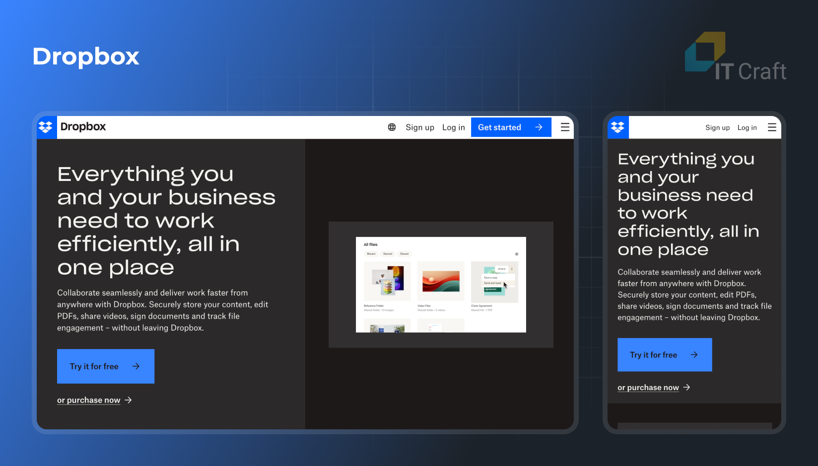
Known for its simplicity and clean design, Dropbox’s website showcases a responsive layout that adjusts effortlessly across devices. Its flexible images and grid-based layout ensure a seamless user experience.
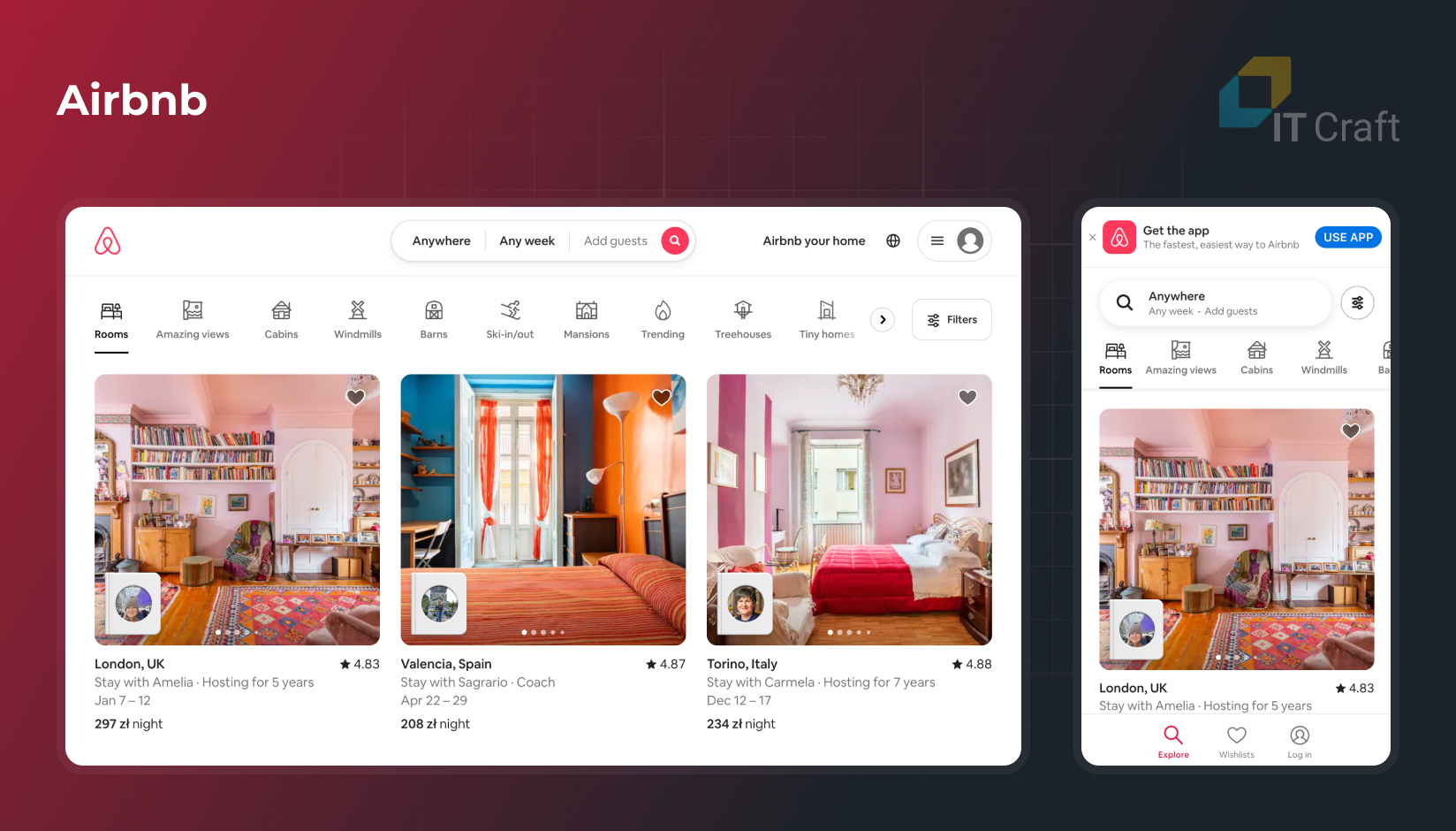
As a platform catering to global users, Airbnb’s website demonstrates responsive design with its adaptable text, images, and navigation elements, making it accessible and user-friendly on any device.
This news website stands out for its responsive design that accommodates various content types, from text articles to multimedia. Its layout dynamically adjusts to different screen sizes, ensuring readability and engagement.
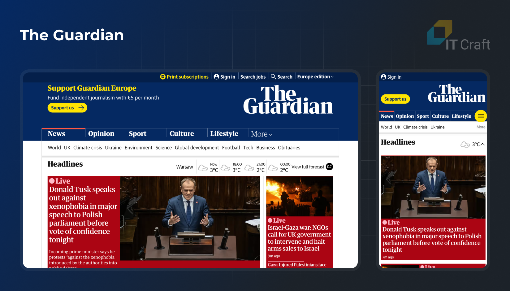
https://www.theguardian.com
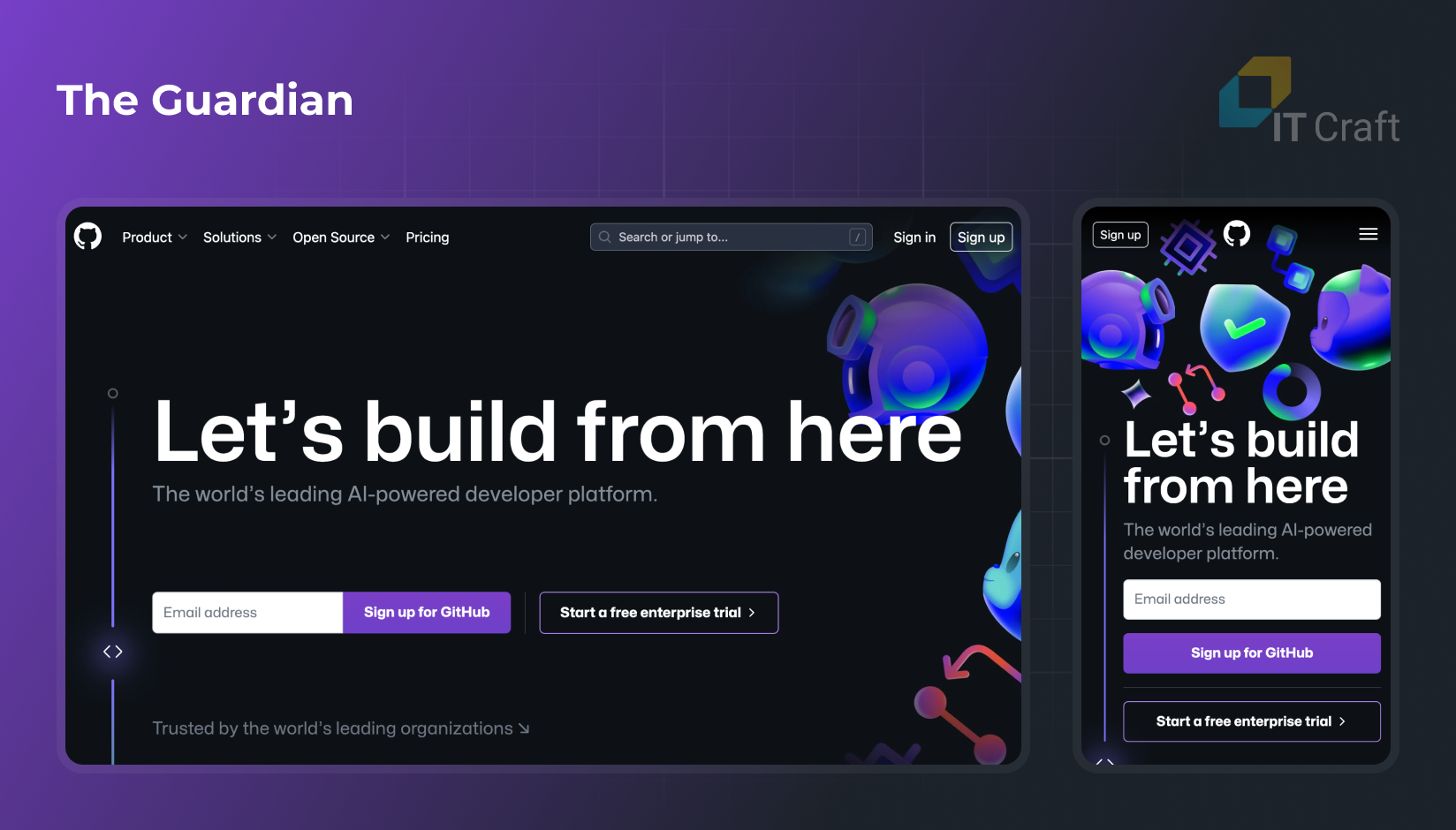
The GitHub website uses a responsive design to cater to developers who may access the site from different devices. Its layout adjusts to provide an optimal viewing experience, whether on a desktop or a mobile device.
These examples demonstrate how responsive web design can be effectively implemented across different industries and website types. From e-commerce to news and collaboration tools to cloud storage, the responsive design enhances user experience by ensuring websites are accessible, navigable, and visually appealing on any device.
4
Advantages and Disadvantages of Adaptive Design
Adaptive design has emerged as a game-changer, offering a new paradigm in study methodologies. This approach, characterized by its flexibility and responsiveness to interim data, has revolutionized and challenged traditional research frameworks.
- Advantages:
- Enhanced Flexibility: Adaptive designs offer unparalleled flexibility, allowing researchers to tailor their approaches in response to interim results. This dynamic adaptability can significantly improve the efficiency and effectiveness of studies.
- Resource Optimization: By allowing for modifications based on early data, adaptive designs can be more resource-efficient. They often require fewer participants and shorter trial durations, translating to cost savings.
- Improved Ethical Considerations: These designs prioritize patient well-being, reduce exposure to ineffective treatments, and align with ethical standards in clinical research.
- Disadvantages:
- EIncreased Complexity: The flexibility of adaptive designs introduces added complexity in planning, execution, and statistical analysis, demanding advanced expertise.
- Regulatory Scrutiny: Their intricate nature often leads to more rigorous regulatory scrutiny, which can delay approvals and increase administrative burdens.
- Risk of Bias: The adaptability of these designs, if not meticulously managed, can introduce biases, potentially skewing results and undermining study integrity.
In summary, adaptive design represents a significant step forward in research methodology, offering benefits in terms of flexibility, resource efficiency, and ethical considerations.
However, these advantages have challenges, including complexity, regulatory hurdles, and potential biases. Careful planning and execution are essential to leverage the full potential of adaptive designs, making them a powerful tool in the arsenal of modern research.
Curious about Adaptive Design?
Explore how Adaptive Design can shape your website's future and tailor your user experience.
Contact us
5
Adaptive Website Examples
Adaptive web design (AWD) tailors user experiences to different device types, creating optimized browsing across various screens. Here are notable examples of adaptive websites:
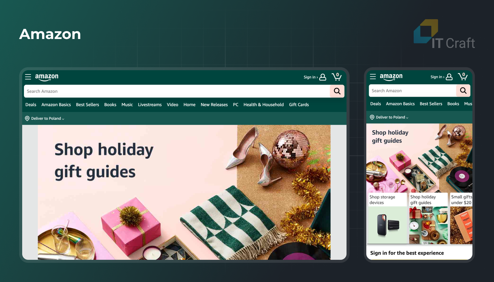
A pioneer in AWD, Amazon’s website detects the user’s device and adjusts layouts accordingly, ensuring a seamless shopping experience whether on desktop, tablet, or mobile.
One of the first major news outlets to adopt AWD, The Boston Globe’s website provides readers with a consistent experience across devices, showcasing how media sites can benefit from adaptivity.
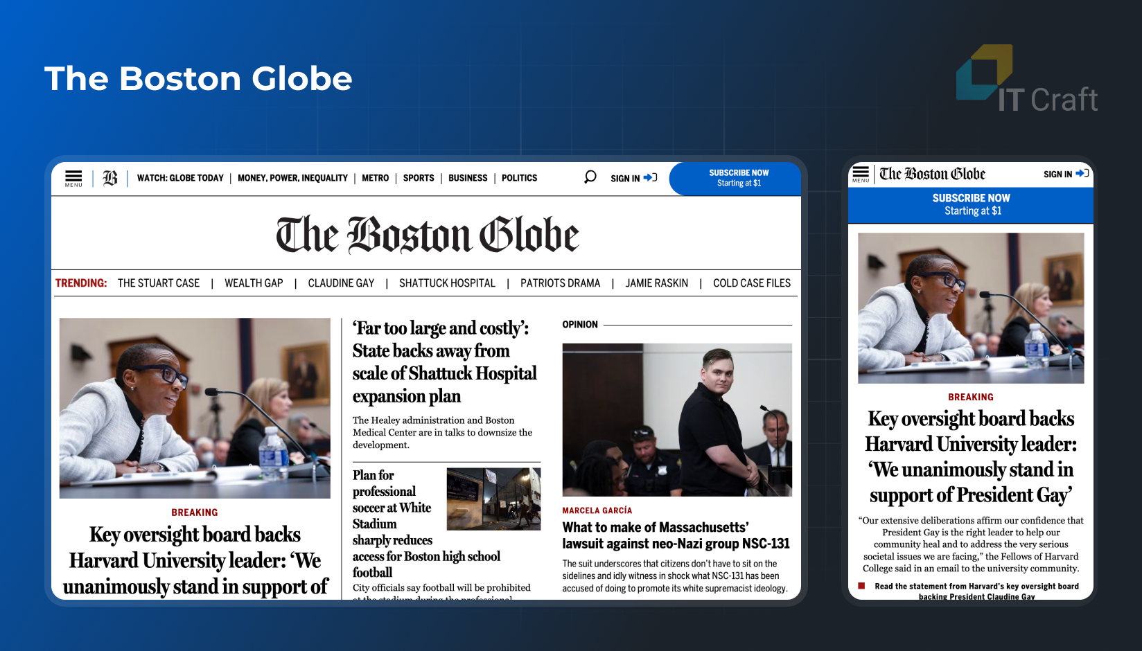
https://www.bostonglobe.com
The mobile version of IKEA provides a more efficient and streamlined user experience. It features a navigation menu that emphasizes product choices, shopping lists, and nearby physical store locations, differing from the desktop version, where an extensive search bar is more prominent.

These examples illustrate how adaptive design can enhance user experience, making websites more accessible and user-friendly. AWD is crucial in modern web design strategies by prioritizing device-specific optimization.
6
Adaptive vs Responsive Web Design: what to choose
Selecting between adaptive and responsive website design is a pivotal decision that hinges on various factors. Each approach has its unique strengths and limitations, which should be considered in the context of your specific project requirements.
- Audience and Device Usage Analysis
In-depth analysis of user data is crucial. If your audience primarily accesses your site via a specific type of device (e.g., mobile phones), adaptive design (AWD) can provide a highly optimized experience for that particular device.
Conversely, responsive web design (RWD) is generally more suitable if your audience uses a wide range of devices. It’s essential to understand the device preferences of your audience – not just in terms of screen size but also in terms of operating systems and browser types to ensure optimal compatibility and user experience.
- Budget and Resource Allocation
Adaptive design demands significant investment in initial development and ongoing maintenance. It requires building multiple versions of your website, each tailored to different screen sizes or devices. This process can be resource-intensive and may require a larger development team.
Evaluate your financial and human resources to determine if you can sustainably support an adaptive design approach. On the other hand, responsive design, with its “one-size-fits-all” approach, tends to be more budget-friendly and less demanding regarding ongoing maintenance.
- SEO Considerations and Web Visibility
Responsive design is often recommended for better search engine optimization (SEO). Major search engines like Google favor responsive websites as they are easier to index and rank.
This preference is due to the single URL structure, which simplifies the crawling process for search engines. Additionally, responsive sites typically offer a more consistent user experience, reducing bounce rates – a factor that positively influences SEO ranking.
- Content Complexity and Specificity
For websites that demand complex functionalities or require specialized, device-specific features, adaptive design may offer more tailored solutions.
This is particularly relevant for web applications with intricate user interfaces or specialized functionalities that vary significantly between desktop and mobile versions. In such cases, the precision and customization offered by adaptive design can dramatically enhance user experience and performance.
- Future-Proofing and Scalability
Future-proofing your website is essential in the rapidly evolving digital landscape. Responsive design is often considered more future-proof, as it is designed to automatically adapt to various screen sizes and new devices that may emerge in the market.
This scalability ensures your website remains functional and aesthetically pleasing across future devices without major redesigns.
In conclusion, the decision between adaptive and responsive design should be made after carefully evaluating your target audience’s needs, your available resources, SEO priorities, the complexity of your content, and the need for future scalability.
By weighing these factors, you can choose a design strategy that meets your current needs and positions your website for long-term success in the ever-changing digital landscape.
To ensure the success of your project, it’s essential to start with the right foundation. That’s why we’ve compiled a list of critical Questions to Launch a Successful Project, designed to guide you through the initial planning phase and set you on the path to achievement.
7
IT Craft Expertise
IT Craft’s expertise illuminates the nuances and practicalities of these two approaches, offering invaluable insights to businesses and developers alike.
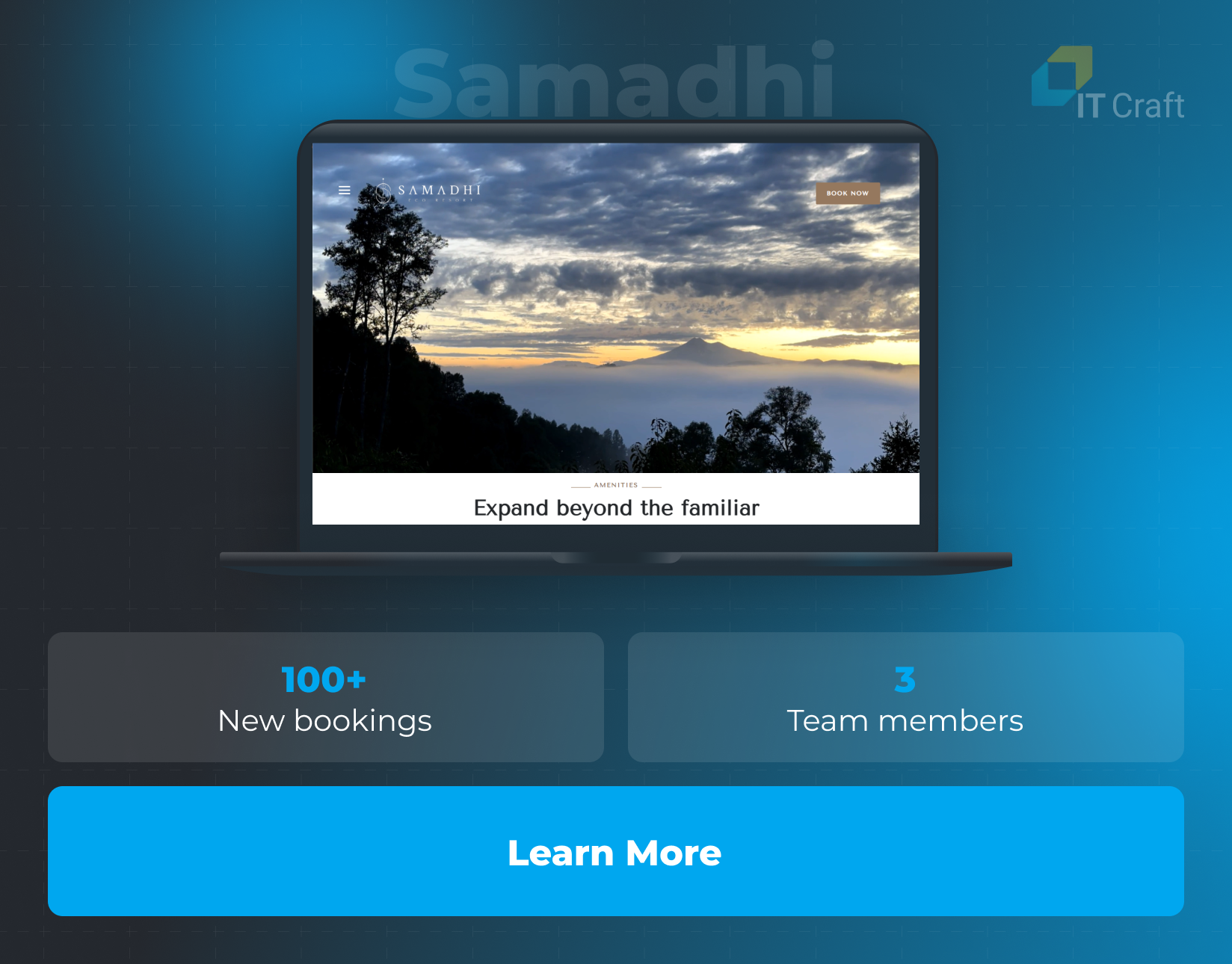
Samadhi Eco Resort: Redefining Eco-Friendly Hospitality
ITCraft played an integral role in transforming Samadhi Eco Resort, a Chilean eco-responsible hotel, with our expertise in web development. Beginning in 2017, this collaboration marked a significant leap in enhancing the resort’s digital presence.
The partnership saw the creation of an engaging, intuitive website from the ground up, perfectly embodying the essence of Samadhi Eco Resort.
This web solution catalyzed the resort’s operational growth and played a pivotal role in its market expansion.
- Website Development & Impact:
The project, completed within a month by a three-member team, led to a substantial increase in bookings, with more than 100 new reservations following the launch.
The website’s success is a testament to ITCraft’s ability to deliver a bespoke solution that resonates with the unique ethos of Samadhi Eco Resort, attracting eco-conscious travelers from around the globe.
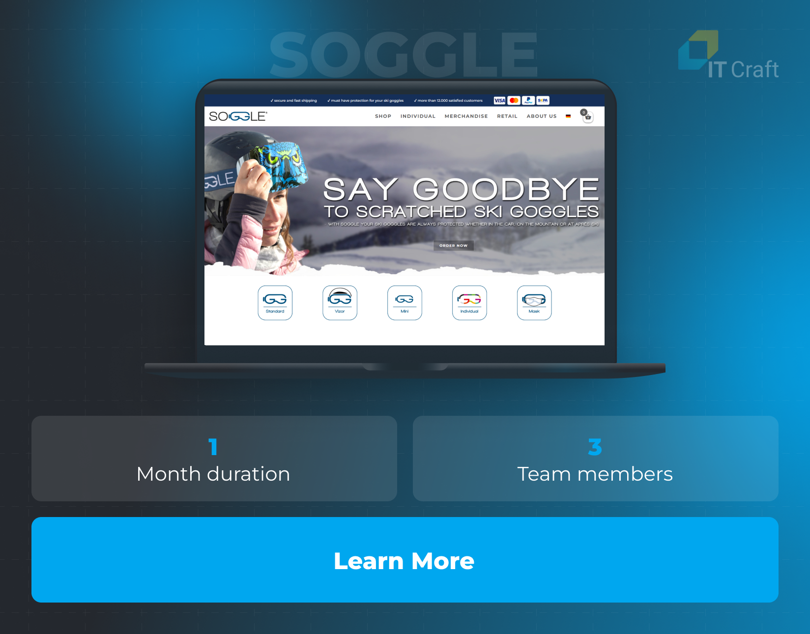
SOGGLE: Redefining Ski Goggle Protection E-commerce
ITCraft and our long-term German partner NINE brackets played a critical role in the advancement of SOGGLE, a leader in ski goggle protection, by enhancing its e-commerce capabilities. The project, completed in a month by a three-member team, significantly boosted SOGGLE’s digital footprint in the sports equipment industry.
This collaboration led to a comprehensive redesign and functional enhancement of SOGGLE’s e-commerce platform. The updated website caters to ski enthusiasts and businesses, offering customized protection tools and microfiber tissues.
- Website Development & Impact:
- The transformation included a complete design and functionality overhaul, resulting in a user-friendly, responsive website.
- This upgrade significantly improved user experience and accessibility, particularly on mobile devices.
- Leveraging technologies like WordPress, PHP, JS, and CSS, the team delivered a dynamic and robust e-commerce solution.
- The revamped SOGGLE website now stands as a model in the sports equipment e-commerce sector, illustrating the impact of targeted web development on customer engagement and sales growth.
!
Conclusion
The choice between adaptive and responsive web design depends on specific project needs. The adaptive design offers tailored experiences for particular devices, ideal for targeted audiences or complex functionalities. Responsive design, however, ensures consistency across all devices and is favored for its flexibility and SEO benefits.
When deciding, consider your audience, budget, content complexity, and future scalability needs. Both approaches aim to enhance user experience, and the right choice varies based on individual project requirements.