iBeacon App Development Services
Enhance your indoor capabilities with a next-gen solution. IT Craft provides full-cycle iBeacon app development services to enhance your operations.
Asset tracking, security alerts, or instant payments—our engineers deliver a top-quality solution for your goal.
How Does iBeacons App Development Help?
iBeacon app development services can help your business in many ways:
Improve visitor
experience
Improve visitor experience
Deliver notifications or start playing audio descriptions when a visitor reaches a point of interest at a designated time.
Create an extra promotional channel
Trigger context-based events such as best deals and discounts. Display product description on the widescreen when a customer takes an item from the shelf.
Receive feedback
and analytics
Receive feedback and analytics
Collect analytics on customer interactions with your advertised items. Use background information to improve customer loyalty.
Automate
inventory maintenance
Automate inventory maintenance
Provide control over equipment or products inside large spaces. Ensure workers know the exact location of items in the store.
Ensure product
quality
Use advanced iBeacon models to measure an item's real-time parameters, such as temperature and humidity, to eliminate spoilage.
Our iBeacons app development services

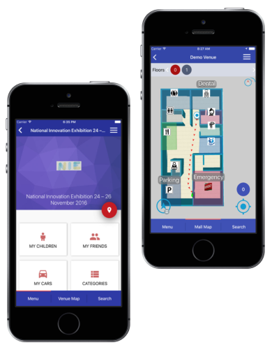
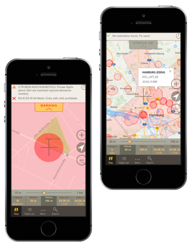
Indoor Positioning And Navigation Systems
An indoor navigation system combines several technologies within one complex system. Our engineers provide all required integrations, calculate the best route, and give precise instructions.

Alert IBeacon
Apps
An alert app simplifies two-way communication. Ensure that employees can immediately activate emergency alerts. Send notifications to responsible persons. Guide users to a safe route. IT Craft builds a system for prompt response.

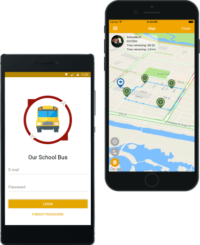
Custom IBeacon Apps For Asset Tracking
iBeacons can be mounted on moving objects to better track processes in a facility. Sensors are used to monitor the location of valuable assets and their conditions. We use cutting-edge technologies to maximize the business value of tracking software.
Proximity-Beacons
Marketing Solutions
iBeacons trigger personalized messages based on user proximity to the store. This can be unique offers, deals, notifications on upcoming events, and more. IT Craft iBeacon app developers build software for superior customer experience.

Interactive
Tours
Provide the lowest-possible entry barriers to museums, exhibitions, and tourist attractions. Make descriptions and instructions available in visitors’ local languages. Provide extra in-app content. We integrate it all in your app.

IBeacons Apps For Mpayments
Be considerate of your customers. Add an alternative contactless payment method. Tie a beacon-carrying item to a specific device or account from which users want to make a purchase. Our team ensures seamless integrations of all modules.

Proximity-Based Social Networking
Add an extra option to your proximity app. iBeacons can help friends find each other in a crowded or an unfamiliar location by sharing precise positions. IT Craft has experience in delivering this type of functionality.

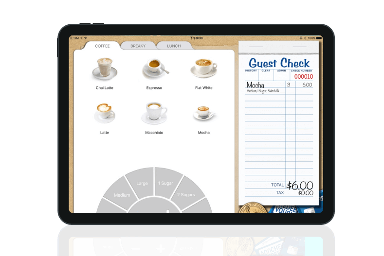
Product Identification Software
When attached to items, iBeacons can detect user interactions with products. They activate information when an event is triggered. We help you build and set up an identification system and then keep it up and running.
Are you looking for five-star iBeacon app development services?
Contact us for a free estimate. Let’s determine the best path to your launch.
Contact Us


Our clients' success stories.
We love to hear what they say about us.
Stories of people impressed by our service offerings
Our Cases
Do you want to enhance your business with an indoor solution?
Start project discovery with IT Craft’s iBeacon app developers. We can help determine what you need to launch the right system.
Contact UsOur Process
IT Craft’s five-step path to efficient iBeacon app development services:
Our Technologies
-

Kontakt.io
-

Estimote
-

Indoor Atlas
-

Esri (Indoo.rs)
-

Kotlin
-

Swift
Key Features of an iBeacon app
Our iBeacon app development company can help you with a wide range of use cases:
Why IT Craft?
Here is how IT Craft enhances your business when you outsource iBeacon app development services to our engineering team:
Expertise
IT Craft’s iBeacon app developers have accumulated extensive experience making stand-alone smart solutions and integrating indoor location technologies into client apps.
Full-cycle development
Our experts select and implement the best technologies for software solutions. They assist you with all required iBeacon app development services you might need to plan, build, launch, and upgrade your software.
Immediate start
With 330+ highly skilled engineers working at our iBeacon app development company, we can find and assign a team capable of taking over software development without delay.
Value-based approach
We help you efficiently handle changing requirements to help you keep pace with your business needs. Our engineers focus on functionality that creates the highest value and prioritizes it on their to-do list.
Our Recognitions
Choose a recognized, reliable partner providing high-end iBeacon app development services, IT Craft.
Industries
iBeacons benefit everyone. Check out how iBeacon app development helps your industry:
-
Hospitals
Provide detailed, in-building navigation and patient auto check-in. Reduce queues by accepting contactless payments. Send alerts to doctors in emergency cases.
-
Shopping malls
Engage customers by sending notifications with offers and deals. Improve customer experience by personalization. Eliminate queues via NFC payments.
-
Museums
Create a personalized tour recommendation in any language. Offer tour plans with marked items. Start playing audio information when a visitor approaches an artifact.
-
Logistics and warehousing
Track the exact location of any tangible assets (equipment, property, valuable objects) using moving BLE beacons. Use BLE beacons with sensors onboard to monitor storage conditions. Receive immediate notifications when conditions deviate from set parameters.
-
Banks
Provide personal greetings to clients. Manage queues, collect analytics on waiting time, and gather feedback on client satisfaction. Let clients carry out contactless, yet safe, ATM operations using smartphones.
-
Offices
Let employees track their time automatically. Automate authorization to certain restricted areas. Send alert notifications when an employee is needed.
Questions from our clients
iBeacon is a special protocol designed by Apple Inc. It is used on small transmitting devices called BLE beacons.
iBeacon helps with the following:
- Indoor positioning and step-by-step navigation
- Tracking solutions
- Promoting products and services
- Improving in-store experience
- Automation solutions
Yes and no.
Yes, an iBeacon is just a small device that periodically transmits signals into an environment.
No, such signal transmission makes little sense. A smartphone can neither recognize nor use it. End users need to install and launch a native app. Plus, to start action after receiving a signal, they must have Bluetooth turned on.
Both Android and iOS support iBeacon detection.
If you are concerned that users might ignore your app, try iOS 14 App Clips to demonstrate the core functionality of your app at a glance.
Beacons are small, inexpensive, low-powered devices equipped with Bluetooth Low Energy (BLE).
Beacons broadcast signals. Beacon signals contain unique ID numbers which a smartphone app can recognize and use for navigation. Smartphones with relevant apps and Bluetooth are turned on to pick up these signals when they are near.
Beacons can also trigger events and send proximity-based notifications with relevant content to user devices. For instance, when people pass by a restaurant, they receive a notification about daily specials.
iBeacons are relatively cheap devices.
Kontakt Anchor Beacons 2 cost $117 for the pack of three.
Estimote sells its Proximity Beacon at €140 ($150) for four units in a kit.
Beaconic offers 4 iBeacons Retail Kit for €89 ($95).
Heavy-duty beacons or beacons with various sensors onboard cost more.
Three is the minimum number of a pack due to the triangulation effect. All manufacturers offer large-order discounts.
The biggest challenge of iBeacon app development is making measuring as precise as possible.
iBeacon signals might:
- Have issues with Wi-Fi interference because both use the same frequencies.
- Incorrectly display when beacons toggle.
- Lose contact with the user's smartphone due to unexpected, moving obstacles.
- Lack of precision in open spaces and large places without walls (e.g., parking garage).
The following actions help increase signal precision:
- Switch to a channel with different frequencies.
- Ensure optimal hanging height and density of iBeacons.
- Tune signal strength and range.
- Develop a hybrid positioning system that uses geofencing and iBeacons.